
How to Test iPhone Duo Apps in Xcode 27.1 Device Hub
A practical developer workflow for testing resizing, device poses, size classes, safe areas, navigation, Split View, and app state before the iPhone Duo launch.
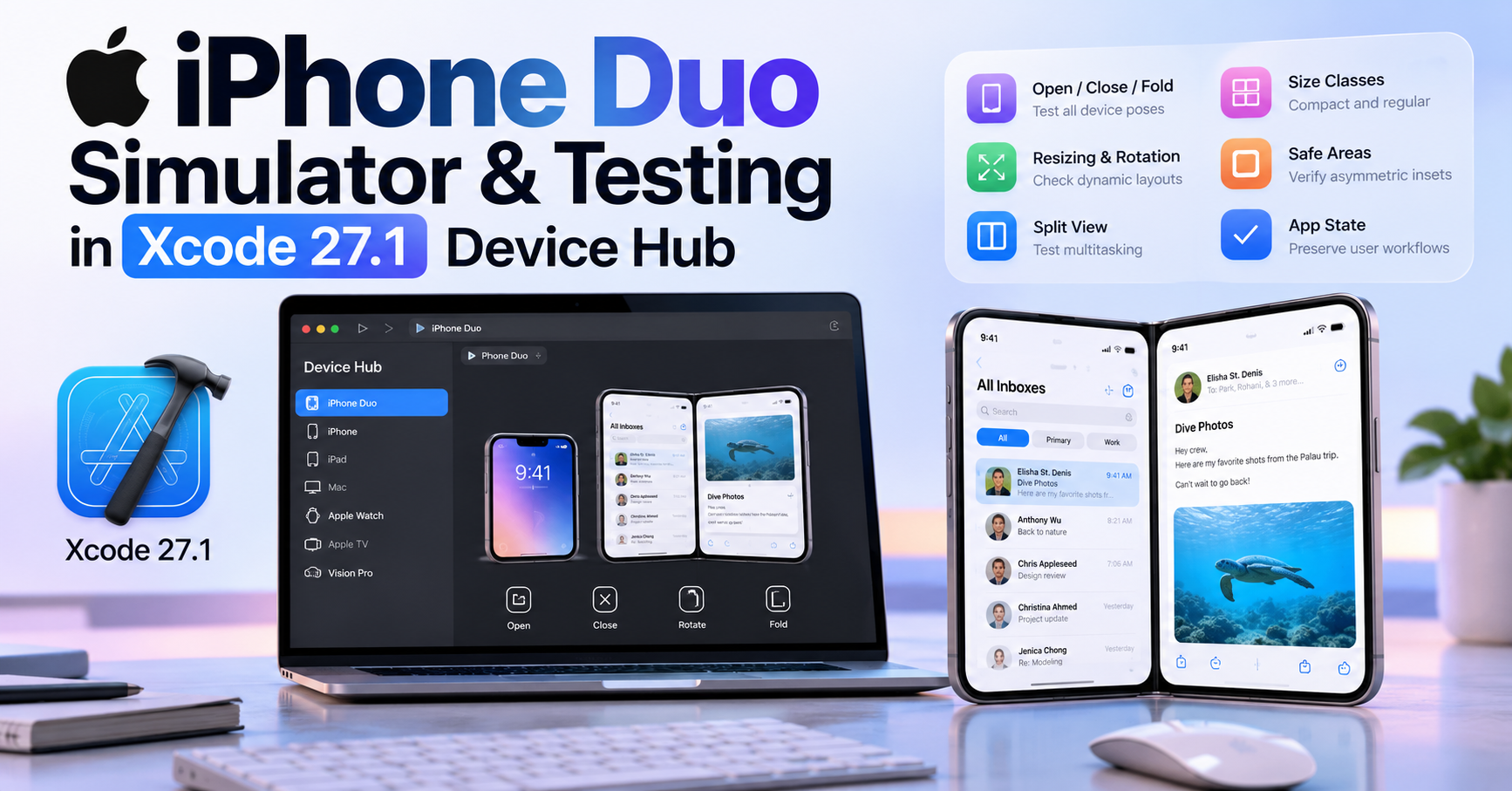
Short answer: to test an app for iPhone Duo, build it with Xcode 27.1, select the iPhone Duo simulator, and run the app in Device Hub. From there, you can open, close, rotate, and fold the simulated device while checking whether your interface resizes correctly, preserves state, respects safe areas, and continues to work across compact and regular size classes.
That sounds simple, but good iPhone Duo testing requires more than opening the app once and checking whether the home screen looks acceptable.
iPhone Duo introduces multiple display configurations, different device poses, changing available space, asymmetric safe areas, Split View multitasking, and new opportunities for standard navigation components to adapt dynamically.
Apple has opened submissions for iPhone Duo optimized apps ahead of the device's October 23, 2026 availability, making this a good time to move from design assumptions to actual simulator testing.
If you have not yet reviewed your project's overall compatibility risks, start with our iPhone Duo app development readiness checklist. This guide focuses specifically on the testing workflow inside Xcode 27.1 and Device Hub.
What Is the iPhone Duo Simulator?
The iPhone Duo simulator is part of the development workflow provided through Xcode 27.1. Apple recommends selecting the iPhone Duo simulator and running your application in Device Hub to see how the interface behaves across different poses and orientations.
This is important because iPhone Duo is not simply another iPhone with a larger fixed display.
The application environment can change while your app remains active. A user may interact with the outer display, open the device to use the larger inner display, rotate it, partially fold it, or use the app beside another application.
The fundamental testing question therefore changes from:
"Does this screen fit this device?"
to:
"Does this interface continue to work correctly as its available space changes?"
That distinction is central to building a reliable iPhone Duo experience.
Why Xcode 27.1 Matters for iPhone Duo
Existing iPhone applications may run on iPhone Duo even if they were built with an older SDK. However, building with the iOS 27.1 SDK gives applications access to the full iPhone Duo screen experience and the latest platform behavior.
Apple's current developer guidance explains that an app built with the iOS 27.1 SDK can extend fully to the screen edges, while standard navigation and toolbar controls can adapt to the device's vertical control layout.
That means testing an old binary alone is not enough if your goal is to optimize the app for the new hardware.
A useful workflow is to test twice:
- run the existing production version and record any visible issues;
- rebuild with Xcode 27.1 and test the optimized version under the same scenarios.
This comparison helps separate problems that already existed in your layout from behavior introduced by taking advantage of the new SDK.
Start With a Baseline Before Changing Code
Developers often make testing harder by changing several layout systems before they know what is actually broken.
A better approach is to establish a baseline.
Open the current project in Xcode 27.1, build the app, launch it on the iPhone Duo simulator, and move through the application's most important screens without immediately editing the code.
Record problems such as:
- clipped text;
- controls outside the visible area;
- unexpected empty space;
- toolbars appearing in the wrong place;
- views that do not expand on the inner display;
- content hidden behind a camera or system region;
- navigation state resetting after resizing;
- hard-coded layouts that remain narrow despite additional space;
- modal interfaces that appear awkwardly after the viewport changes.
This gives you a concrete list of failures to solve instead of attempting a broad rewrite.
Run the App in iPhone Duo Device Hub
After installing Xcode 27.1 and the required simulator runtime, select iPhone Duo as the target simulator and run your application.
Device Hub provides controls that let you change the simulated physical configuration of the device.
Apple specifically recommends using these controls to open, close, rotate, and fold the device.
Do not treat those controls as a visual demo. Use each configuration as a real test environment.
For every important screen in your app, ask:
- Does the content remain visible?
- Do controls remain tappable?
- Does navigation stay understandable?
- Does the interface take advantage of additional space?
- Does the app preserve the user's current task?
If you can answer those questions confidently across different configurations, the app is moving toward genuine resizability.
Test the Closed Outer Display First
The closed configuration is a useful starting point because it represents the more compact iPhone Duo experience.
Apple describes the outer display as a compact-width environment. It is wider and shorter than a traditional iPhone screen, and standard system controls can move to the side to preserve vertical space.
Start with your most common workflows.
Check the application's launch screen, onboarding, authentication, primary navigation, search, detail pages, forms, media playback, settings, and any revenue-critical screens such as checkout or subscription purchase flows.
Pay particular attention to interfaces that previously assumed a tall portrait display.
A design can technically fit within the available bounds and still feel poor if important content becomes vertically compressed or if custom controls consume too much space.
Open the Device and Test the Inner Display
Next, transition to the larger inner display without restarting the application.
This is where many hidden layout assumptions become obvious.
A view that looked acceptable on the outer display may stay unnecessarily narrow after more space becomes available. Another screen may stretch content so far that text becomes difficult to read. A navigation system designed around one column may ignore an opportunity to display additional hierarchy.
Apple's design guidance recommends treating the inner display as a regular-width environment and allowing interfaces to expand naturally rather than designing a completely unrelated version of the app.
For example, a compact interface may show a list and then navigate to a detail view. On the larger inner display, the same information hierarchy may work better with the list and selected detail visible side by side.
The goal is continuity, not reinvention.
Check Size Classes Instead of Physical Device States
One of the most important testing habits for iPhone Duo is to stop thinking primarily in terms of "folded" and "unfolded."
Application layout should usually react to the available environment.
In SwiftUI, you can inspect horizontal and vertical size classes:
@Environment(\.horizontalSizeClass)
private var horizontalSizeClass

@Environment(\.verticalSizeClass)
private var verticalSizeClass
UIKit applications can use the current trait collection:
let horizontal = traitCollection.horizontalSizeClass
let vertical = traitCollection.verticalSizeClass
While testing, watch how the application responds as these characteristics change.
Your interface should not need to know that the user physically moved the hinge to a particular angle merely to choose an appropriate layout.
The available width, size class, safe area, and current container often provide more useful information.
Do Not Use Interface Orientation as Your Main Layout Signal
Traditional iPhone applications sometimes contain layout code based heavily on portrait-versus-landscape assumptions.
That becomes less reliable as applications appear in more flexible environments.
Instead of asking only whether the device is portrait or landscape, test what the app does when the actual content region changes.
Two interfaces with the same physical orientation may have significantly different available widths because one application is full screen while another participates in multitasking.
Size classes and container dimensions therefore make better layout signals for most adaptive UI decisions.
Search for UIScreen.main While You Test
If a screen behaves incorrectly when moving between display environments, search the related code for assumptions about a single global screen.
For example:
UIScreen.main.bounds
UIScreen.main.bounds.width
UIScreen.main.bounds.height
UIScreen.main.scale
On a device with multiple display contexts, these assumptions can become ambiguous.
If you genuinely need information about the screen associated with the current window, obtain it from the active window scene:
let screen = window?.windowScene?.screen
In many situations, however, you do not need physical screen dimensions at all.
If you are laying out a view, the size of its current container is generally more relevant than the dimensions of a global display.
Apple also provides an example where code using:
let screenScale = UIScreen.main.scale
can instead use information from the current trait environment:
let screenScale = traitCollection.displayScale
The testing principle is straightforward: when you find a visual bug, trace the layout decision back to the environment information it uses.
Test Standard Navigation Before Building Custom Navigation
Standard SwiftUI and UIKit navigation components are especially useful on iPhone Duo because Apple has already designed them to adapt across changing environments.
For SwiftUI applications with hierarchical content, NavigationSplitView is worth testing before creating a custom master-detail layout.
NavigationSplitView {
    SidebarView()
} detail: {
    DetailView()
}
On a compact environment, the hierarchy can collapse into navigation appropriate for the smaller display. With more space available, multiple columns can become visible.
UIKit developers should similarly test UISplitViewController.
Also review your tab bars, toolbars, sheets, popovers, alerts, and context menus.
Apple's system components can adapt their presentation and control placement depending on the current Duo configuration.
If a standard component already solves the resizing problem, replacing it with manually positioned controls usually creates more work to maintain.
Test Vertical Controls on the Outer Display
One visible difference on iPhone Duo is the treatment of standard controls.
Because the outer display is wider and shorter than traditional iPhone displays, system navigation elements, toolbars, and tab bars can move to the side to preserve vertical content space.
This is an area where custom interface chrome needs careful testing.
If your application manually reproduces navigation bars or reserves fixed top and bottom padding, it may waste space or conflict with the platform's adaptive behavior.
When using standard components, much of this adjustment happens automatically.
Use Device Hub to verify rather than assume.
Check Safe Areas in Every Pose
Safe-area testing deserves its own pass.
iPhone Duo includes hardware and system regions that can make available margins asymmetric. The correct inset on one edge is not necessarily the correct inset on the opposite edge.
Inspect interfaces with:
- custom toolbars;
- floating buttons;
- video controls;
- full-screen images;
- maps;
- games;
- drawing canvases;
- camera previews;
- custom bottom or side navigation.
Keep important interactive foreground content within the safe area unless the UI deliberately uses a more advanced layout technique.
Decorative backgrounds can often extend beyond it.
Do not test safe areas in just one configuration. Open, close, rotate, and partially fold the simulator while watching how those insets change.
Understand Reserved Regions in iOS 27.1
Some applications need more control than standard safe areas provide.
For iOS 27.1, Apple introduces reserved-region APIs that let custom interfaces make fuller use of the available display while avoiding system-provided UI.
For SwiftUI, Apple provides ReservedRegion. UIKit has UIViewReservedRegion.
These APIs are particularly relevant to edge-to-edge experiences and custom bars.
However, do not adopt them merely because they are new.
If standard safe areas and navigation components already produce a good result, simpler code may be the more maintainable solution.
Test Split View Multitasking
A full-screen app is only one possible environment on the inner display.
iPhone Duo supports two apps side by side, which means your app needs to remain usable with a smaller share of the available width.
This is an excellent stress test for code that assumes the largest possible inner-display dimensions.
Run your application in Split View and test the same important workflows you tested at full size.
Look for:
- navigation labels that no longer fit;
- toolbars with too many actions;
- tables that require excessive horizontal scrolling;
- images with fixed dimensions;
- forms whose labels and controls collide;
- two-column layouts that should collapse to one;
- custom sidebars that consume too much space.
If the app only works well when it owns the entire display, it is not fully adaptable yet.
Test State Preservation While Resizing
Visual layout bugs are easy to notice. State-management bugs can be more damaging.
Imagine a user writing a long message, editing a document, filling in checkout information, reading an article, or watching a video.
Opening the device or changing the available viewport should not unexpectedly reset that task.
During simulator testing, deliberately change the layout while the application is in the middle of an action.
Verify that the app preserves:
- selected items;
- navigation path;
- scroll position where appropriate;
- text input;
- unsaved edits;
- media playback position;
- filter and search state;
- shopping cart contents;
- modal context where appropriate.
This is one of the clearest differences between merely making an interface resize and creating a continuous user experience.
Test the Keyboard and Text Input
The software keyboard can significantly change the available content region.
Test every important form with the keyboard visible while the device changes configuration.
Login, registration, search, checkout, chat, comments, document editing, and account settings are common failure points.
Verify that the currently edited field remains visible, important actions can still be reached, scrolling behaves correctly, and custom keyboard avoidance code does not create excessive gaps.
Applications with hard-coded offsets for keyboard height deserve extra attention.
Test Dynamic Type and Long Text
An interface that works with short English labels can still fail badly with larger accessibility text or localized content.
After the basic Duo layout works, repeat key tests with larger Dynamic Type sizes.
Look for text that truncates unnecessarily, controls that overlap, fixed-height containers that clip content, and interfaces that become impossible to scroll.
This is particularly important because a layout that dynamically changes width may expose text-sizing bugs that remained hidden on the device you previously used for development.
Test Media, Picture in Picture, and Resizing
Media applications deserve additional testing because video can alter the available layout and may continue playing while users change the device configuration.
Verify playback continuity while opening or closing the device, entering or leaving Picture in Picture, rotating, and changing the app's available space.
The interface surrounding the media should adapt without interrupting playback unnecessarily.
Also check that controls remain reachable and do not collide with safe areas or custom overlays.
Use a Repeatable iPhone Duo Test Matrix
Instead of relying on memory, create a small test matrix for every release candidate.
| Environment | Main checks |
|---|---|
| Outer display | Compact layout, vertical controls, core workflow |
| Inner display | Regular-width expansion, hierarchy, sidebars |
| Open/close transition | State preservation and layout continuity |
| Rotation | Resizing and content reflow |
| Partial fold | Visibility, interaction, safe areas |
| Split View | Narrow-width adaptability |
| Keyboard visible | Forms, scrolling, active fields |
| Large Dynamic Type | Text wrapping and accessible layouts |
| Media/Picture in Picture | Playback continuity and resizing |
This matrix does not need to become a huge QA document.
The goal is simply to prevent developers from testing one visually impressive Duo configuration while accidentally ignoring the environments most likely to expose real bugs.
Try Xcode's App Resizability Skill
Apple has also updated the app modernization workflow in Xcode 27.1.
The capability previously introduced for app modernization is now called App Resizability, with support for SwiftUI and iPhone Duo.
It can help identify patterns that make an application less adaptable.
Use automated assistance as another signal, not as a substitute for manual testing.
A tool can identify suspicious layout code, but it cannot determine whether a checkout flow feels awkward, whether important hierarchy becomes confusing, or whether a resized interface still matches your product's intended experience.
Common iPhone Duo Testing Mistakes
The first common mistake is testing only screenshots. iPhone Duo is fundamentally about a changing environment, so transitions matter.
The second is testing only the inner display because it looks new and visually impressive. The outer display remains an important everyday configuration.
The third is rewriting the entire app before establishing a baseline. Many applications built with standard adaptive components may need much less work than expected.
The fourth is creating device-specific breakpoints for every physical pose. Apple recommends using adaptable layouts and size classes instead of building a custom screen for every possible fold state.
The fifth is validating layout but ignoring state preservation. Users care about completing their task, not simply whether the interface remains inside its bounds.
The sixth is assuming that supporting full-screen iPhone Duo automatically means supporting Split View well. Test both.
What Should You Fix First?
If testing reveals many problems, prioritize issues that prevent users from completing core tasks.
A practical order is:
- crashes or unusable screens;
- controls that cannot be reached;
- lost application or user state;
- content hidden by system regions;
- navigation failures;
- major resizing problems;
- poor use of the larger display;
- minor visual polish.
This keeps the project focused on user impact rather than cosmetic perfection.
Do You Need a Physical iPhone Duo to Start?
No. The purpose of Xcode's iPhone Duo simulator and Device Hub is to let developers begin compatibility and layout testing before relying on physical hardware.
A simulator cannot reproduce every characteristic of a real device, so production teams should still perform appropriate physical-device testing when hardware becomes available.
But you should not wait for a retail device before finding basic problems with fixed widths, screen assumptions, navigation, size classes, safe areas, or Split View.
Frequently Asked Questions
Which Xcode version supports the iPhone Duo simulator?
Apple says Xcode 27.1 adds development support for iPhone Duo and provides the workflow for running apps with the iPhone Duo simulator in Device Hub.
What can Device Hub simulate for iPhone Duo?
Apple's current developer guidance shows Device Hub controls for opening, closing, rotating, and folding iPhone Duo so developers can inspect how an app behaves across different poses and orientations.
Should I create a different UI for every iPhone Duo pose?
Usually not. Apple recommends adaptive layouts based on available space and size classes rather than completely separate interfaces for every physical pose.
What size class does the iPhone Duo outer display use?
The outer-display experience is primarily a compact-width environment. The larger inner display provides a regular-width environment that can support richer hierarchy and split-view layouts.
Should an iPhone Duo app use UIScreen.main?
Avoid depending on a single global main-screen assumption. When screen information is genuinely necessary, obtain it from the relevant scene or current environment. For many layout decisions, container size and trait information are more appropriate.
Should I test Split View?
Yes. Split View can give the application substantially less width than the full inner display, making it an important test for true resizability.
Can an existing app work on iPhone Duo without Xcode 27.1?
Existing apps can run on iPhone Duo, but rebuilding with the iOS 27.1 SDK enables the newest iPhone Duo development behavior and lets you properly test an optimized full-screen experience.
Final iPhone Duo Testing Workflow
You do not need to redesign every screen before you can begin testing.
Start with the version of your app that exists today.
Build it with Xcode 27.1, run it on the iPhone Duo simulator, and use Device Hub to change the device configuration while real workflows are active.
Test the compact outer display, the larger inner display, rotation, folding, Split View, keyboard interaction, Dynamic Type, navigation, safe areas, and state preservation.
When a problem appears, fix the assumption behind it rather than adding a patch for one specific simulator pose.
That approach produces something more valuable than an app that merely supports iPhone Duo.
It produces an app that is better prepared for resizable interfaces in general.
And that is likely to keep paying off long after the October 23 launch.
Last reviewed: October 7, 2026.
Apple may update Xcode, iOS, simulator behavior, or developer guidance. Verify current requirements against Apple's official developer documentation before shipping a production build.
Rubic8 Editorial Team
Editorial Team
Rubic8 creates practical guides and free tools for developers, webmasters, and digital publishers. Our fast-changing technical content is reviewed against current primary documentation before publication.
